

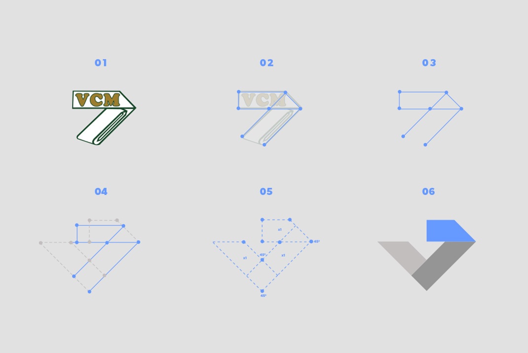
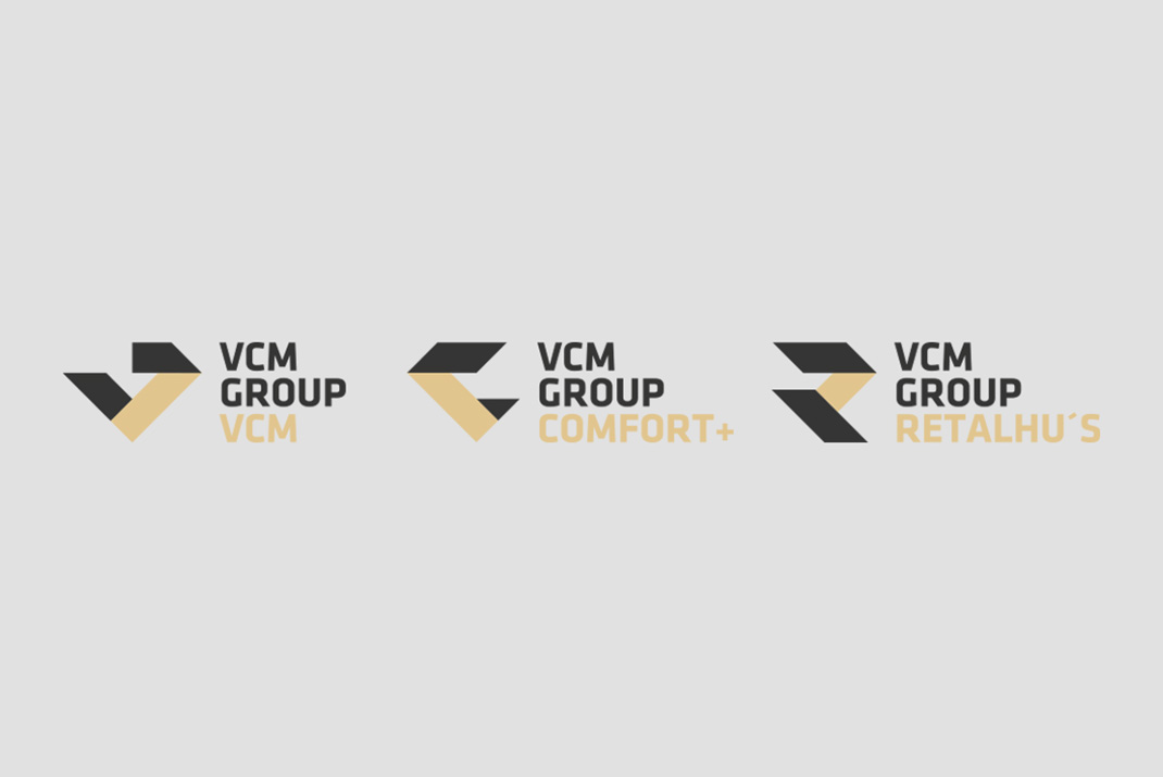
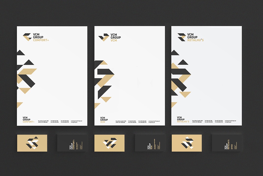
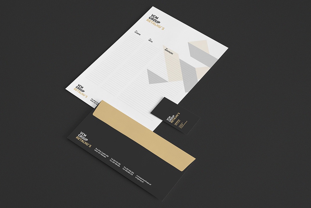
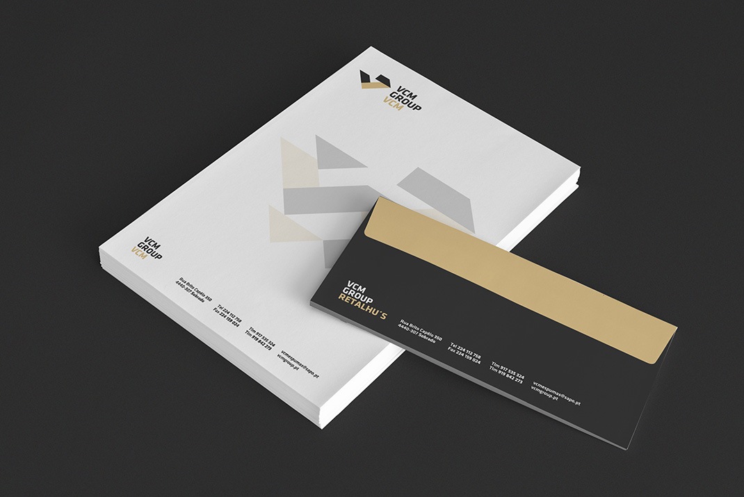
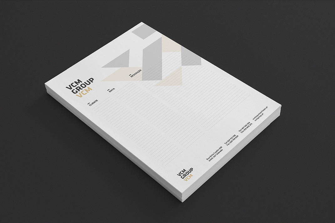
VCM is a company that has been selling upholstery products for almost 20 years. A few years back, they created a new business branch that sells fabrics as a complement to their main business line. Since the company was expanding and a third branch, related with wadding, was about to open, they felt the need to rebrand their image. The premise was to create a new logo that could converge the three new companies into a new Brand, with only one limitation: the new logo can’t diverge completely from the existent one, due to its historical context.


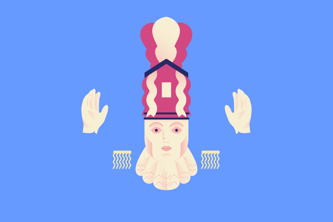
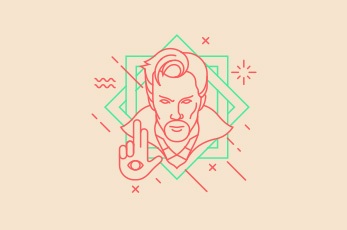
This project illustrates the Bugiada. A very popular and old tradition that happens every year in the small town of Sobrado, Portugal. It represents the fight between moors and christians for the possession of a miracle saint. Both factions fight each other through typical dances led by their rightful leader. Although, similarities can be seen in their clothing, they show a very distinctive personality. This project represents them in their most well know pose. While one presents a more military stand, the other shows a more informal and opened posture.


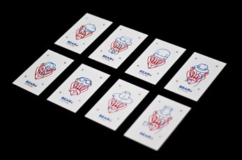

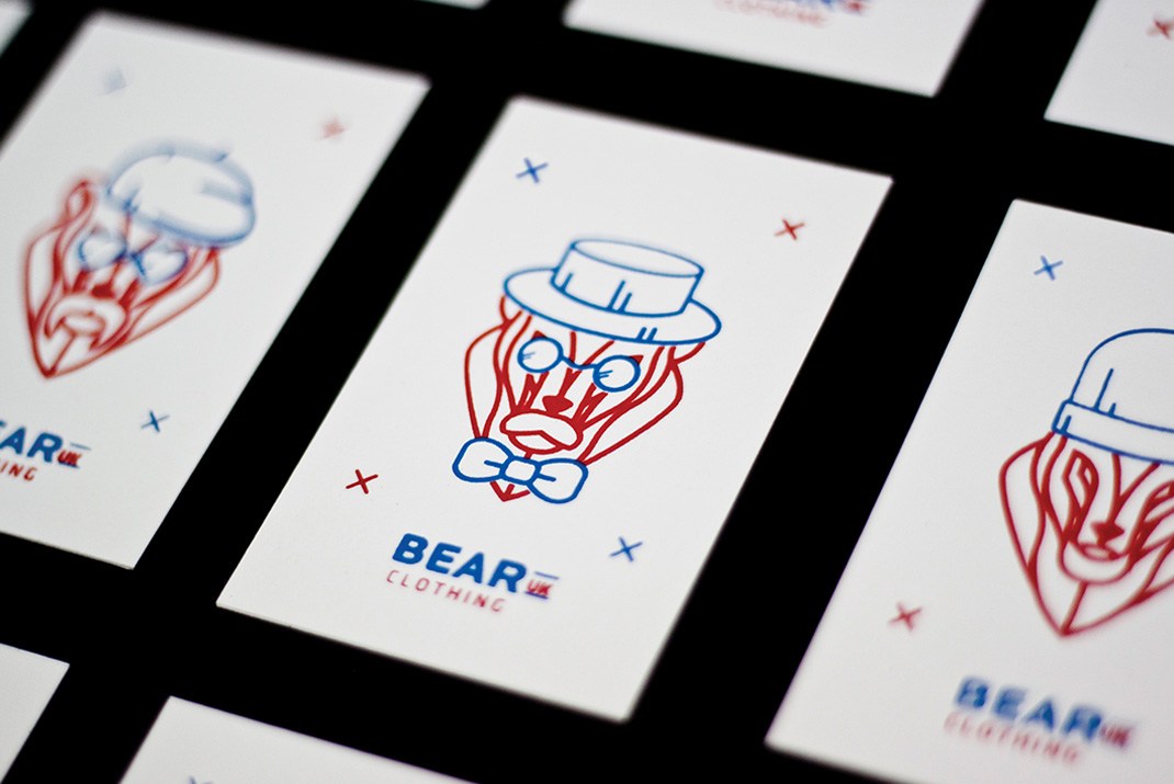
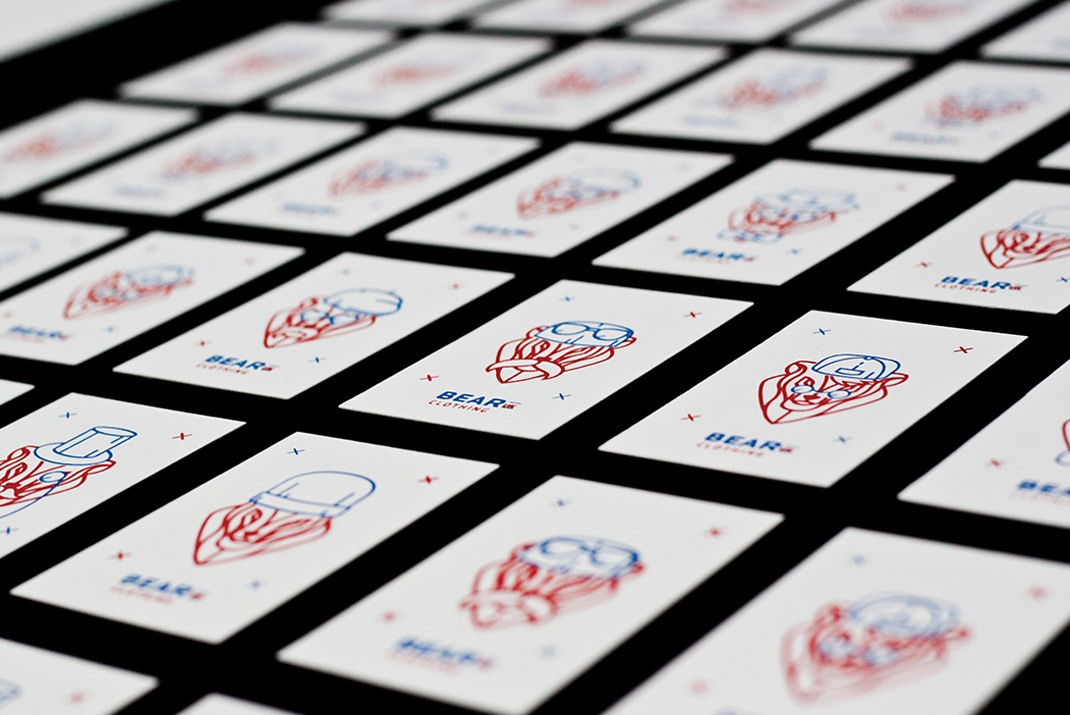
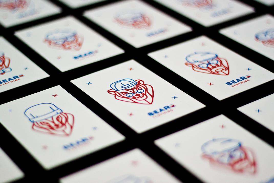
Bear Clothing UK is a fashion apparel brand in the United Kingdom, presenting themselves as a manly brand. They were looking for a new visual identity, an image that could be reflected as both sophisticated and humorous, in a visual minimalistic way. This project had no real limitations in terms of briefing, they were really open minded about it. The only really requirement being, as the Brand name suggests, the implementation of a bear. By developing a main logo as the core part of the visual identity, the implementation of an extensive set of apparel icons, were the main factor in expanding the brand imaginary. Allowing it to have a several options in terms of personalization and combination.

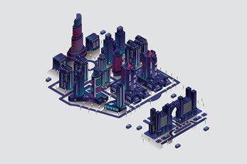
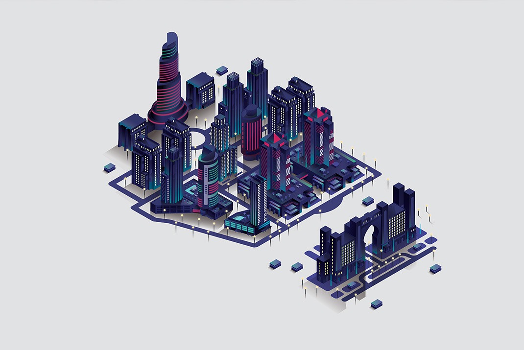
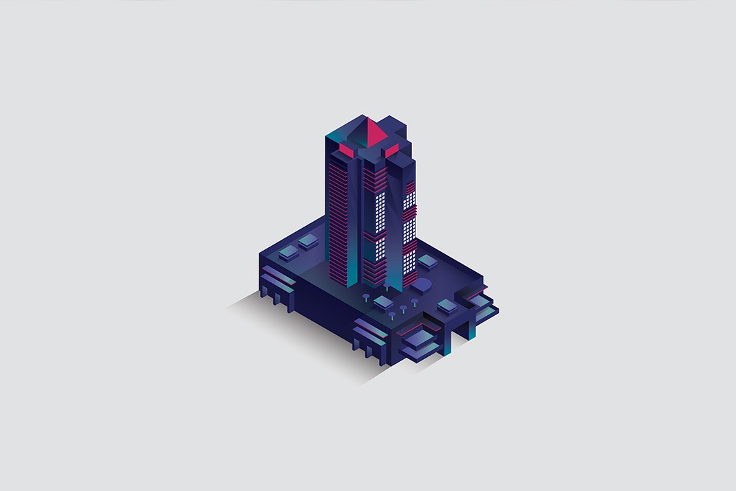
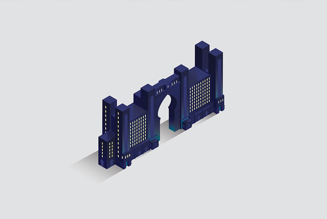
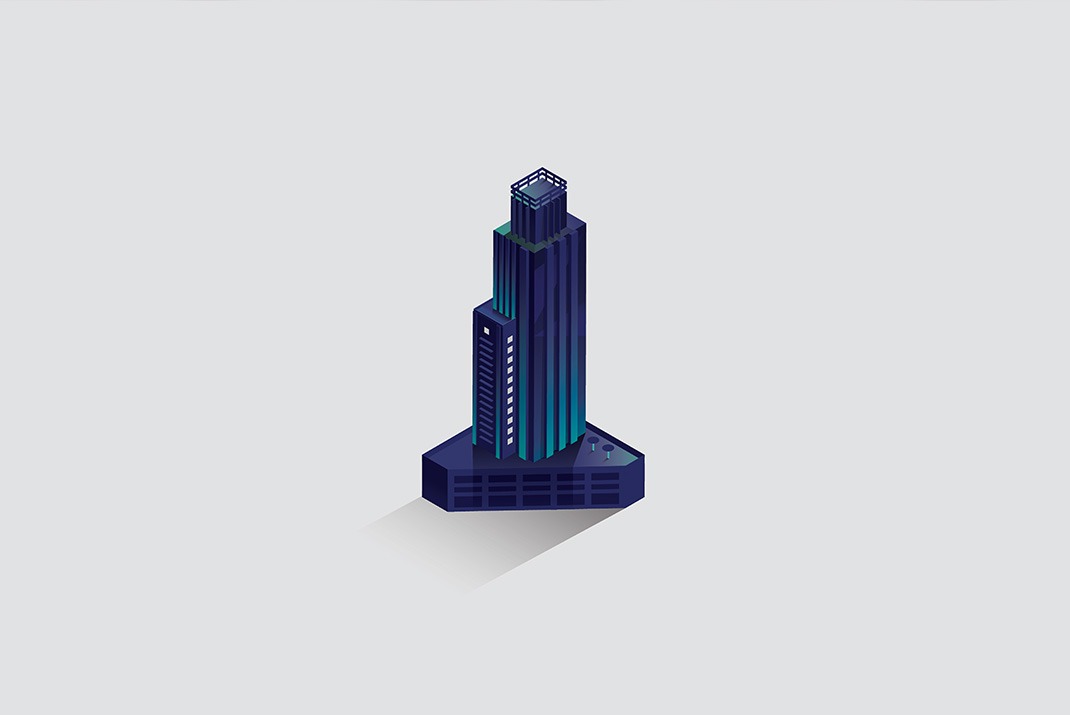
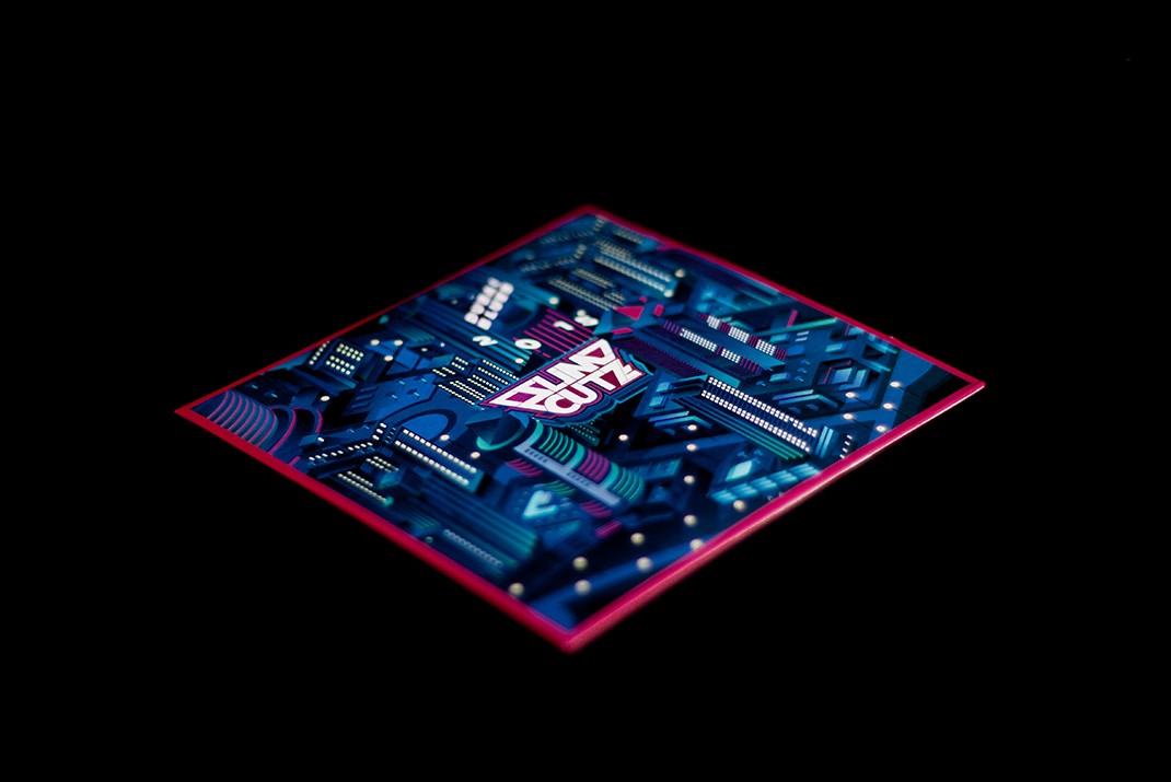
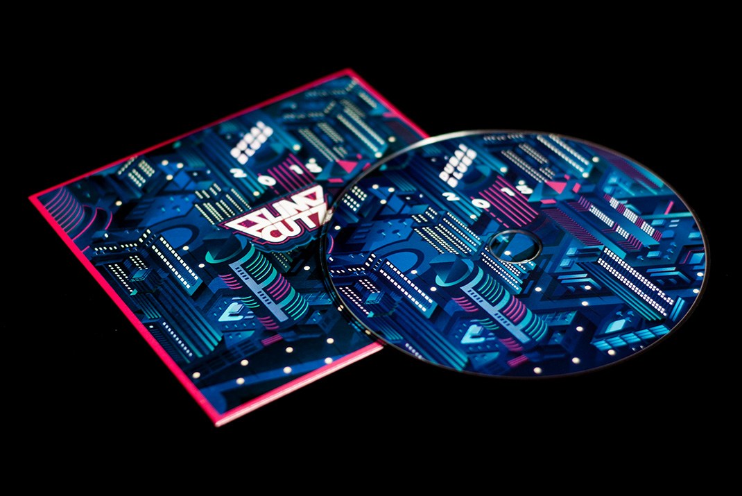
In 2015, I was invited to illustrate "Dubai Blues", the latest mixtape by Dj Slimcutz. The concept was to Illustrate the cover with isometric buildings based on the theme of the mixtape. Between the scale and the variety of the structures I was developing, the Illustration soon began to expand, becoming a much bigger and detailed artwork.


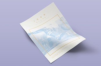


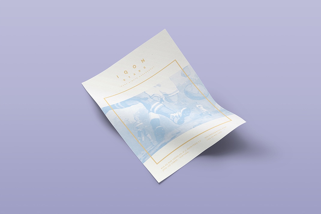
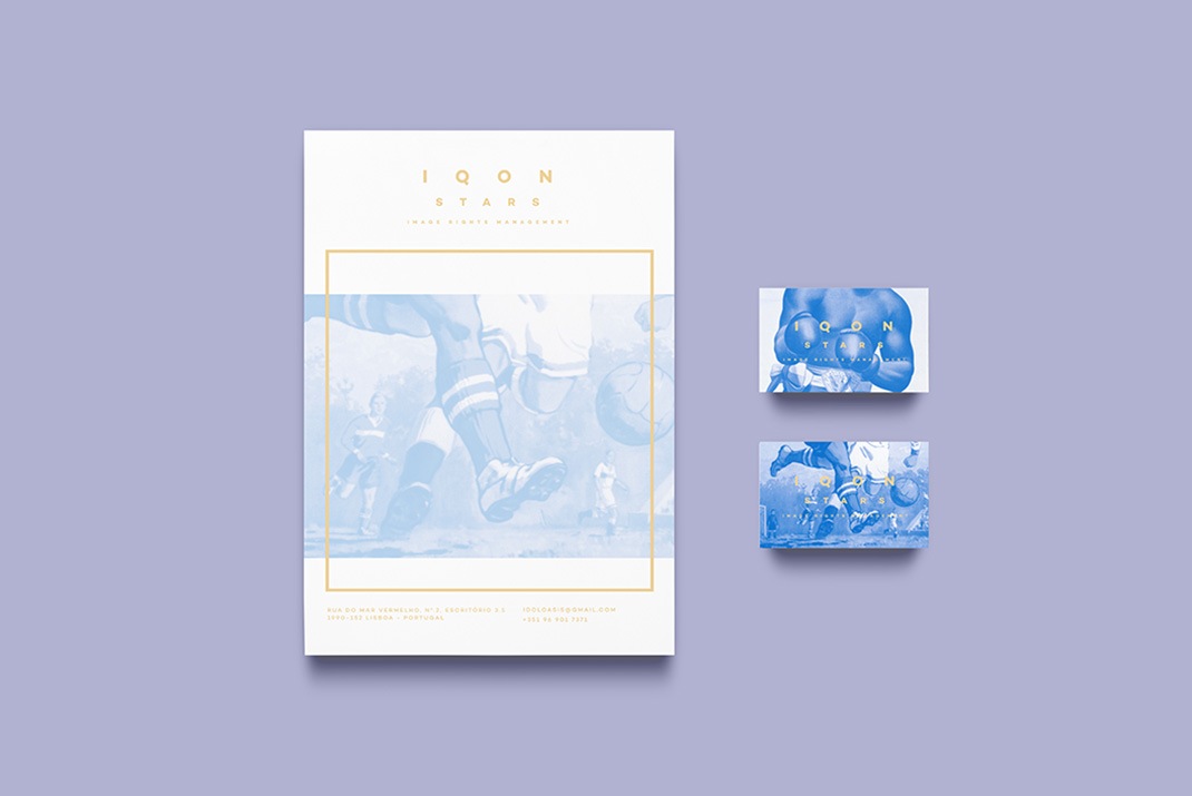
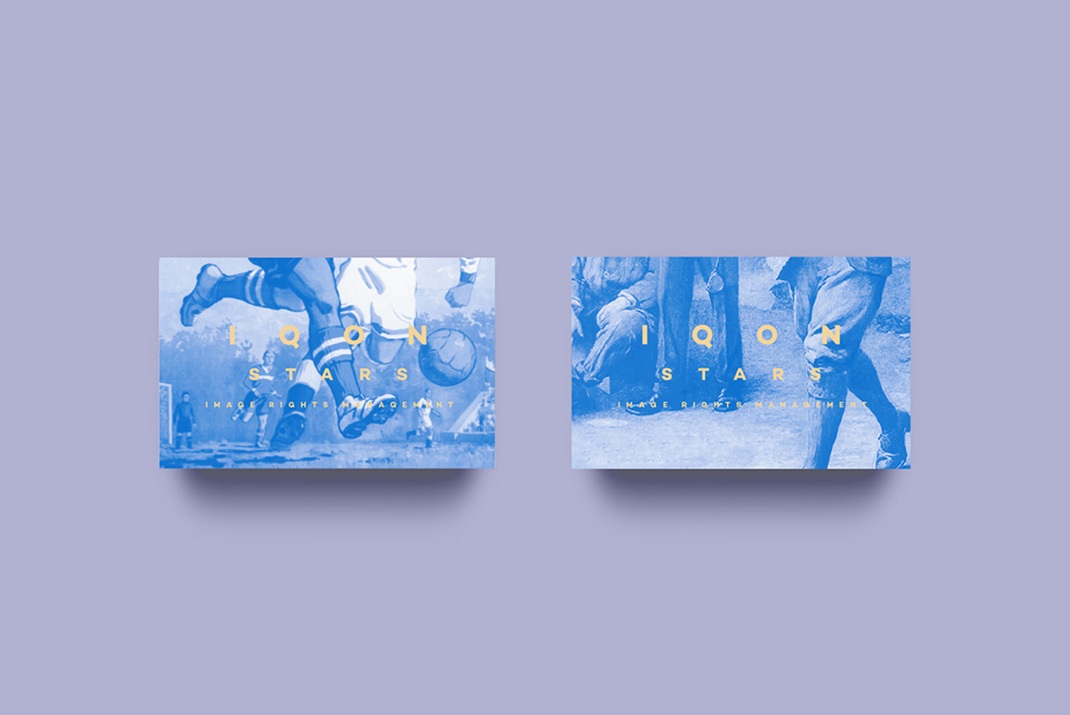
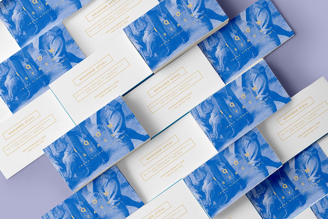
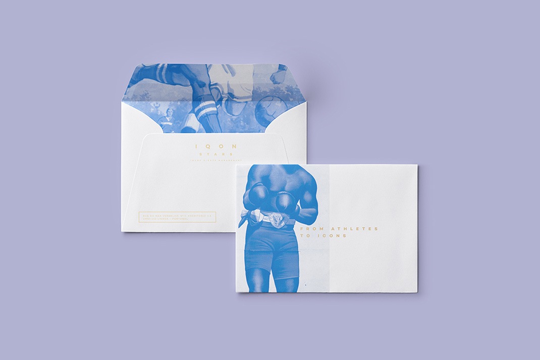
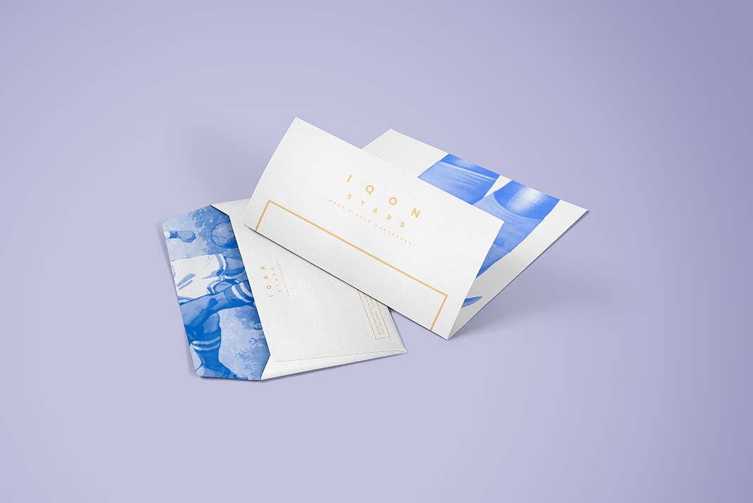
Iqon Stars is a new promoting agency for athletes searching for a visual identity that could represent their passion for vintage sports with the look of a corporate business. The concept, was to combine a neutral typographic logo with illustrations. The logo would be bold enough to represent the brand by itself, while its application in the most varied graphic media, would be supplemented with the sports imaginary, creating that vintage feeling.
Copywriting: Pedro Tavares
Design: Tiago Machado
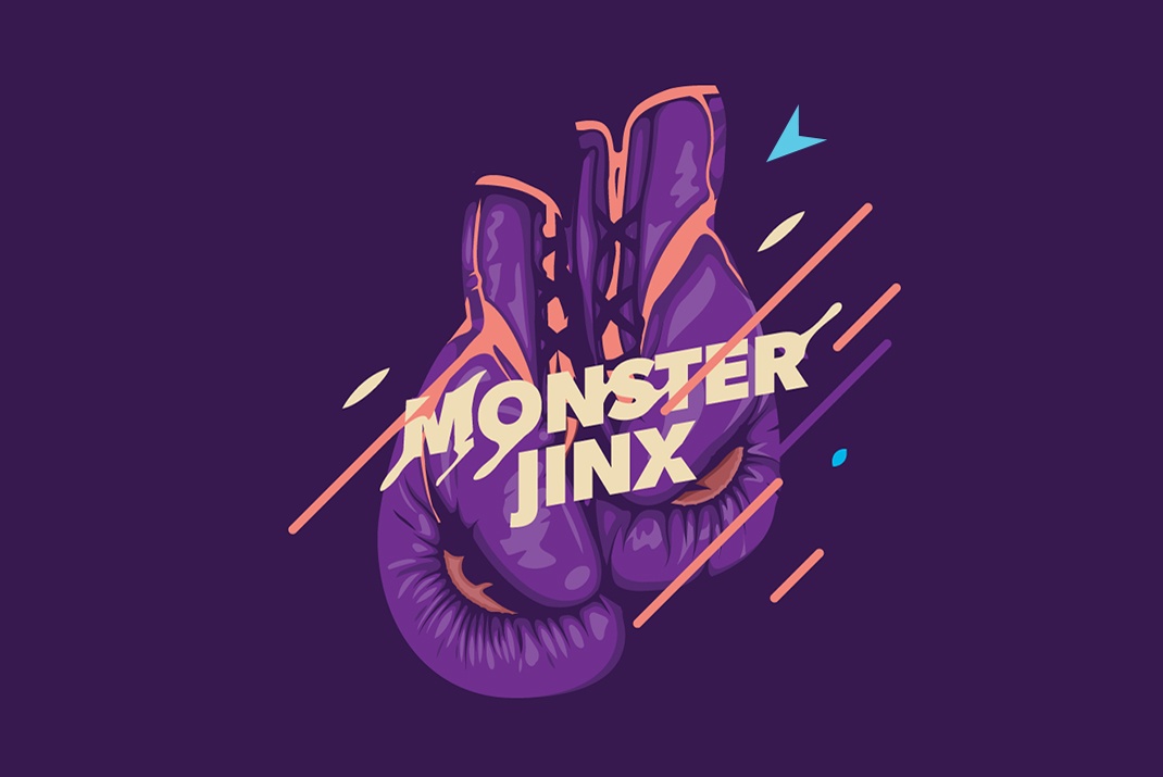
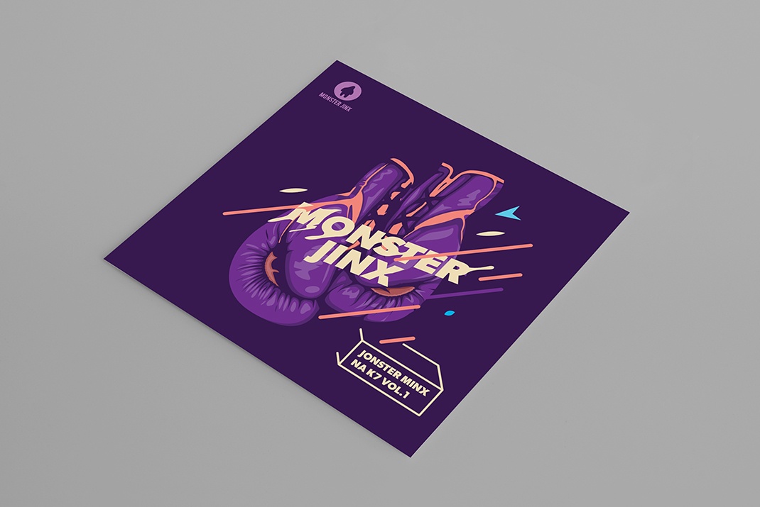
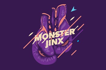
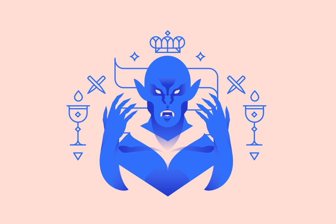
Monster Jinx is an artist collective and a platform for the edition and distribution of independent music. Jonster Minx was a visual proposal for their first collective album, representing the fight of 8 active years as a music platform.